[Illustrating Research & Creativity #1] “What is ‘Contribution’? How to Do Research? ” Part 1/3
My name is Ken Nakagaki, a 5th year Ph.D. student at MIT Media Lab. I do research related to the future of user interfaces, such as shape-changing displays/devices in the field of Human Computer Interaction and Interaction Design. (check my portfolio for learning about my research).
‘Illustrating Research and Creativity’
From this post, I would like to start a new series of blog posts, named ‘Illustrating Research and Creativity’.
I have been involved in the research community for a while, at quite a special place, MIT Media Lab, a research institution where advanced technology and creativity meet for humanity. In the past few years, I have been devoting myself to creating illustrations that graphically describe my belief and interpretation of research and creativity (in parallel to my research😄).
These diagrams have been great media for me to reflect on my own thoughts, but also to share with my colleague and junior students to convey abstract concepts and methodologies. Now, as the end of my Ph.D. journey is approaching, I would like to start sharing these diagrams with you and the world…!
*Note: These diagrams are only one of the many ways of interpreting research and creativity — they are created to convey one or a few core concepts around a theme, and none of them are ‘everything’ about research and creativity.
In the first three posts, I want to share a series of diagrams I created to describe ‘how to do research’ originally created for junior students in my group. Our group often accepts amazing artists, designers, and creators, who are not necessarily familiar with ‘research’ and they often struggle to learn ‘how to write and publish a paper.’
This diagram was created for those who are new to research about ‘what is contribution’, but graphically describe.
“Contribution”
Let’s start by looking at the webpage of CHI2021 (the biggest conference in our field).

When you look at the page, you see the word ‘contribution’ appear over and over. I think this is something special in the research community. I first would like to graphically describe what ‘contribution’ is.
Push the Edge of Human Knowledge
The first diagram is actually built upon the famous illustration, ‘The Illustrated Guide to a Ph.D.’ by Prof. Matt Might. In case you don’t know, I paste it below. [If you already know this diagram, you can skip till the ==END OF REFERENCE==]
==REFERENCE STARTS HERE==
*I skipped a few images just to keep this article short. But PLEASE check the original copy if you haven’t.
Imagine a circle that contains all of human knowledge:

By the time you finish elementary school, you know a little (blue area):
By the time you finish high school, you know a bit more: (green area)
With a bachelor’s degree, you gain a specialty: (light red are)
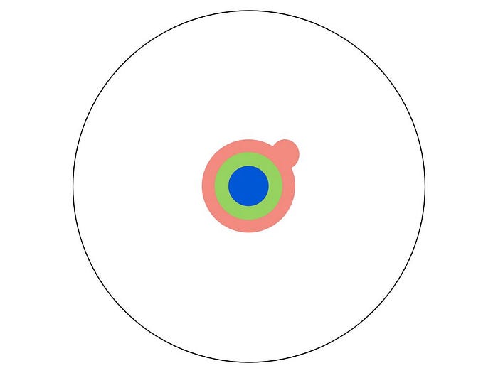
A master’s degree deepens that specialty: (red area)
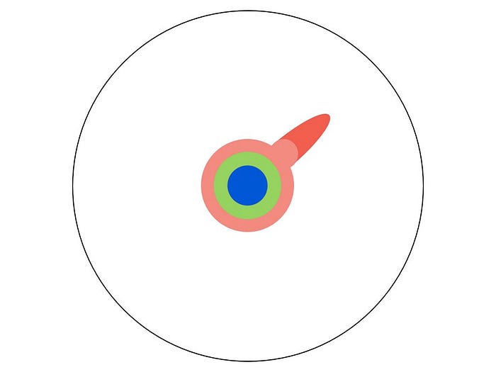
Reading research papers takes you to the edge of human knowledge:
Once you’re at the boundary, you focus:
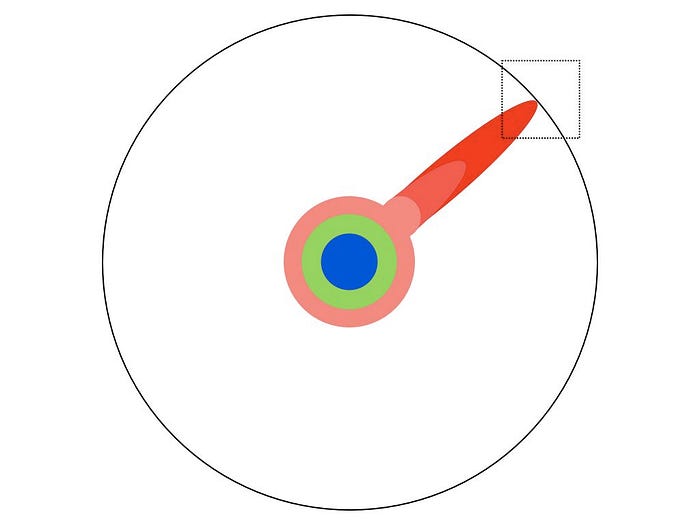
You push at the boundary for a few years:

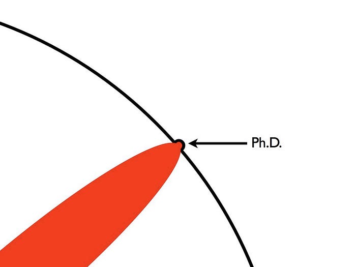
Until one day, the boundary gives way:
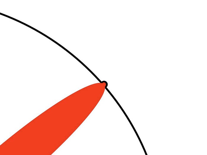
And, that dent you’ve made is called a Ph.D.:
Of course, the world looks different to you now:
So, don’t forget the bigger picture:
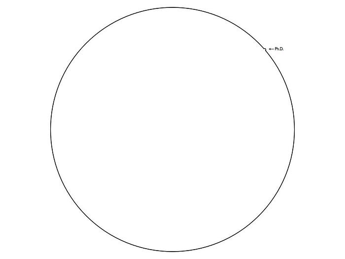
Keep pushing.
==END OF REFERENCE==
…I feel this is one of the best examples that verify the power of illustration. Simple and Profound. Isn’t it…?

Anyway, my own interpretation of this illustration is that ANY research/paper should be pushing the edge of human knowledge regardless of Ph.D. And simply I believe this is what contribution is — contribution pushes human knowledge.
(I respect how Prof. Might’s diagram is generalizable in that sense beyond the definition of Ph.D.)
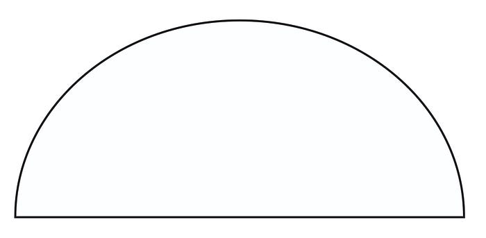
My Own Take: Adding Z-Dimension — The Dome
Ok, as I have clarified my interpretation, I would like to take you further… Here is my own modification to this illustration — by adding a new dimension, yeah literally, ‘The Z-dimension’.

(The original illustration is in Creative Commons Attribution-NonCommercial 2.5 License, allowing modifications, so why not!)
…So, with the addition of Z-dimension, it is now a Dome of Human Knowledge, and if you look at it from the side, it looks like this:
Now you may notice that you can push the edge of the dome in two different directions — VERTICAL or HORIZONTAL.
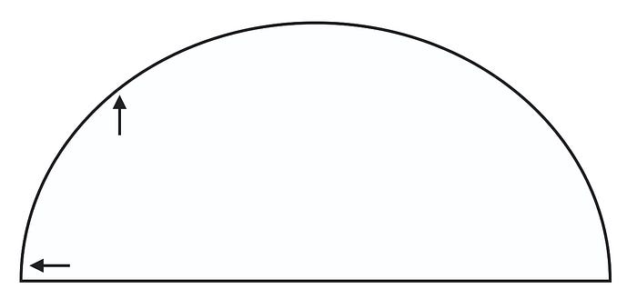
I define the HORIZONTAL axis as ‘creating new concepts and visions’.
This is something my group and the lab is generally good at and aim to do — like ‘creating the next big ideas’.
Today’s technologies will become obsolete in one year, and today’s applications will be replaced in 10 years, but true visions can last longer than 100 years. — Prof. Hiroshi Ishii (refer his talk on Vision-driven Research).
The research that pushes the dome in the horizontal direction creates a new land or ground where other researchers would build upon.

On the other hand, I define the VERTICAL axis as ‘deploying existing concepts to the world and society.’
This direction is equally important to the HORIZONTAL axis, bringing the groundbreaking concepts and visions to reality in our daily life. What is interesting is that there seems like a threshold in the vertical axis, where the research actually becomes part of our human life.
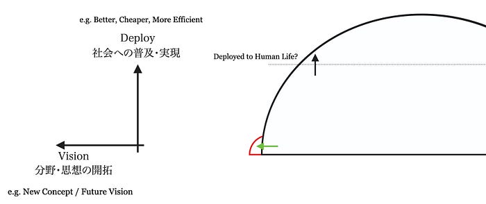
Let me give you some examples from HCI research…
Multi-touch technology (originally invented in the 1970s) has come to our life as iPhone was sold in 2007, which is now deployed in every human beings’ pockets.
The first Head-Mounted Display (Virtual Reality) was invented and published by the legendary pioneer Ivan Sutherland, and we have seen them rapidly coming to the market and reality in the past 10 years — passing THE ‘threshold’.
(Gartner Hype Cycle is an interesting reference about how technology become part of our life.)
Yet, I personally care and get excited about pushing the edge of the dome in the horizontal direction, both directions are equally important. It is not about which is better or worse — they complement each other to advance, innovate, and improve our future.
When you do research, you better be aware of yourself about which direction you are going to (or want to) push the dome towards — because ultimately we do research to contribute to the world, and that’s what ‘contribution’ is about.
… Prof. Might’s illustration ended with a simple but strong message ‘Keep Pushing.’ I would like to add one more message at the end — ‘How do you push?’:

This is Part 1 of “What is ‘Contribution’? How to Do Research? ” illustration series out of 3 Parts. Please follow me on Medium or Twitter (@ken0324)to get notified of new posts :)
Part 2 will be on illustrating research in ‘Dots and Arrows’.
I would be more than happy to hear your thoughts (an agreement, disagreement, or even your modifications!), so please feel free to reach me out on Twitter.
*You are welcome to share my diagrams and writings as long as you credit me, Ken Nakagaki, and link to this blog post.
*All my diagrams and writings are under the Creative Commons Attribution-NonCommercial 2.5 License.
